Mobile Matters
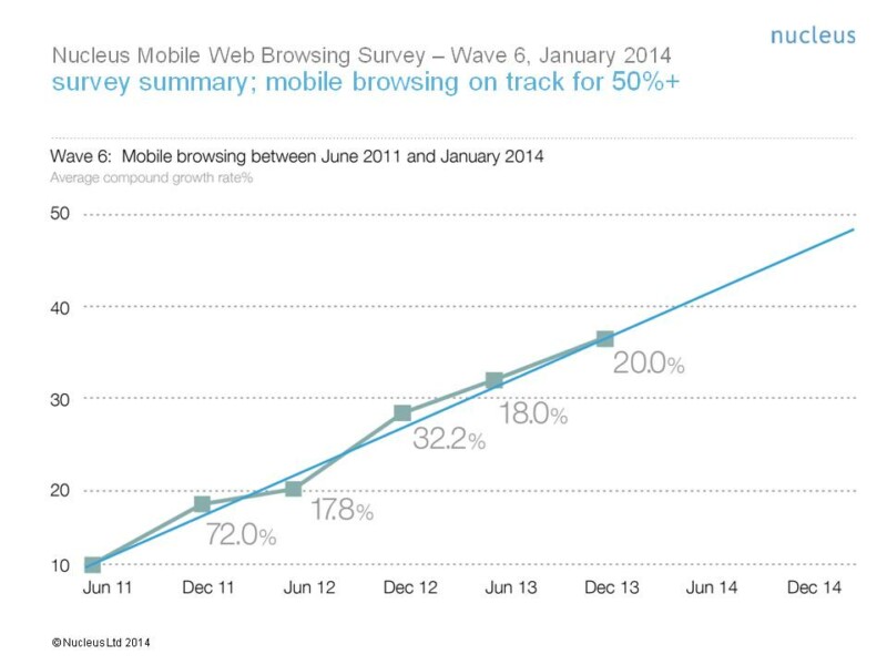
Nucleus, the brand, digital and intellectual property consultancy has been regularly surveying its clients since 2011, tracking the growth in mobile web browsing. The company’s latest survey highlights the continued move towards a mobile-first user experience. Mobile traffic has been growing at 42% year on year. Projecting the rate of growth, Nucleus is forecasting that mobile browsing will account for the majority of all web traffic by January 2015 and this may happen even earlier for luxury brands whose clients are more likely to be using the latest mobile consumer electronics for their surfing. (Use this link to access the survey.)
What this means is that by this time next year, if you are re-designing your website, it needs to be mobile-optimised first. The majority of your web visitors will be arriving on your site using their mobile devices. Less than half of your visitors will be reaching you on an old fashioned mouse-driven computer.
Now it seems that Nucleus defines a mobile as a device running Android or Apple’s iOS operating systems, so I suspect that your mobile enabled visitors may not be surfing your website on their small screen mobile phones but are more likely to be on their tablets. Tablets are the most popularly used web surfing devices in the evenings, ie. when folk are at home discussing their holidays. Mobile phones come to the fore during the morning commute and PC surfing predominates by day – probably office PCs being used during lunch and coffee breaks. Thinking about my own surfing habits, this seems to hold true as I suspect it might do for you.
What your prospective customers are expecting from you is a seamless and coherent website experience as they move between devices – mobile phone, tablet and PC. Your website needs to be recognisably familiar regardless of the device being used. It needs to be usefully functional and equally usable across all devices
So, how are we doing in travel? The Internet Advertising Bureau in the UK surveyed the UK’s top travel brands. It found that over a third (34%) do not have any kind of mobile presence and that just around 20% offer a seamless purchase path between device types. Moreover, less than half (48%) of the UK’s top travel brands have a mobile app. Of those that have an app, just over half offer a fully transactional service. Perhaps the others don’t care whether customers book or not. I hope this isn’t true of your organisation!
So, there is a real opportunity to steal a march on your competitors. If they are looking lousy on mobile, this is your opportunity to outdo them and capture the growing number of potential customers who are using mobile as their primary why of accessing your online presence.
What to do? When you are ready to re-develop your website, make sure it is done using Responsive Design. This will ensure that your website adapts seamlessly between mobile phones, tablets, laptops and desktops. It will be your single website that will always look familiar to visitors as they move between devices. It will be designed to reconfigure itself to be well optimised and eminently usable on whichever device your potential customer is using.
Mobile matters. You need to be thinking mobile first. The majority of your customers are going to be on mobile. My advice: don’t design a PC website and adapt it for mobile. Design a mobile site first that caters for the majority and then use responsive design to adapt this for the dwindling number of people who have not yet abandoned their laptops and PCs.